One of the downsides of e-publishing and being an independent author is that you have to figure everything out for yourself: where to find an editor, how to get cover art done, how to format your work, how to promote it when it’s out, etc. etc. etc. There’s nobody you can hand the book off to and say, “Okay, I wrote it; you guys take care of the rest.”
That can be daunting, but the other side of the coin is that e-publishing on your own gives you a lot of freedom too. You get to choose your editor, your artist, how you promote, etc. And if something isn’t working, you can change it. That’s a pretty big perk.
Right now, I’m tinkering with my novel Encrypted. Oh, not the story itself, but the packaging, if you will.
Back in January, when I first published it, I wasn’t quite sure how to categorize it or what kind of cover art would work for the story. It was a little high fantasy, a little mystery/thriller, a little science fiction, and a little romance. Not a clothes-being-ripped-off-and-nekkid-bodies-contorting-in-wild-ways kind of romance, but there was definitely a love story. I wanted to try and get all the main ideas into the blurb, so I ended up writing one that was longer than necessary (and, as a couple of readers mentioned, revealed a secret that it probably shouldn’t have).
Yesterday, I went in and shaved a couple of sentences off of the blurb. It’s still on the long side compared to my other ones, but I’ve cut out that secret and taken some of the emphasis away from the love story (more than one male reader has said, “Hey, I liked this book, but could you please not call it a romance, because I don’t read romances?”).
I considered that for a while and decided it was much less of a romance than most that get tagged with that label (as I mentioned, no nekkid contorting bodies). And, as another lady mentioned, the body count is quite high for a pure love story. (Like I’d write a book where there were more kisses than monster attacks? As if… :D) So, I’m trying to emphasize the mystery/thriller aspect more in the new blurb and in the cover art as well.
Yup, I’m changing that too.
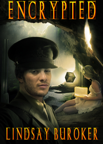
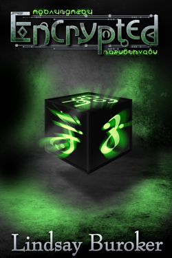
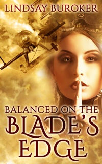
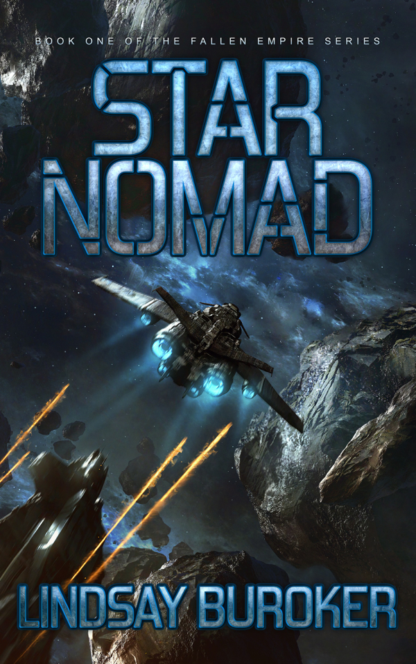
I’ve had a few folks mention that they weren’t crazy about the cover art, so, with Glendon’s help, I’m trying a different look. (Pictures of old and new below.)
I don’t know if the changes will affect sales at all, but right now a lot of the folks who buy Encrypted seem to do so because they read my Emperor’s Edge books (which I’ve put more effort into promoting). That’s great, of course, but I’ll be curious of maybe I can snag more readers out of the random Amazon ether. Since Encrypted stands alone, there’s no need to read my other stories before giving it a try.
My reason for sharing these ramblings is just to show one author’s path and point out that it’s nice (and useful!) that you can tinker when it comes to ebooks. You probably noticed that a lot of changes I’m making are based on reader feedback. People who publish under the traditional model don’t have the option to change up the packaging, and try different things, so e-publishing is one area where indies have an advantage.
Nothing is set in stone. You can revise the text, fix typos or formatting problems that slip through, re-do the cover art, the blurb, etc. And, of course, you can play around with price to see what works best too.
For the curious, here’s the old art and the new art:
Oh yes, love the new cover. Excellent.
I like the new cover too. It’s hard to do covers with characters on the front because readers have certain expectations of what the heroes look like and it’s hard to match that.
I love the new cover. Really draws me in.
As for me, I’ve been playing around with categories, seeing which draws in my readers.
It’s such a science experiment, but I’m sure glad I have that control. Sitting on my hands wondering would drive me crazy.
I like the new cover, but I believe ebook covers should be more symbolic anyway.
You might be better off marketing it as a romance. Romance sells better, although you could do both. I marketed my book as just fantasy, but after a review decided to market it as YA. Seems to be working better for me.
Pure romance is popular and some of the subsets are too (paranormal romance, historical) but SF/F romance is a little more niche!
Oh my, but that new cover fits so much better and is stunning too.
I think being able to make changes to improve a book’s presentation is one of the huge draws to self-publishing for me. And being able to use reader feedback for that…well, that’s just awesome.
The mystery/thriller genre is where I’d put this…yes there are other aspects/genres but it came across as more of a thriller to me 🙂
That is a nice perk. Maybe I need to take romance off ‘Translations’, too.
Love the new cover. I noted it the other day when perusing artists. I need some pro help with my first paid release.
Anyway, it is amazing what we learn by doing this ourselves though — what sells, what people are looking for, etc … Things we’d probably never be exposed to going the old-fashioned route.
Oh, this new cover is much better! It’s a great cover, without comparing it to the old one.
Thanks for the comments, all!
Great points! I really like the idea of being able to tailor your book approach based on reader feedback. The new cover looks fantastic!
Like the new cover.
I think the ability to edit and modify has helped me out of paralysis. It doesn’t have to be perfect. I don’t have to worry about it being perfect. I know I can always change the content, the cover, the blurb, etc.
On the other hand, if you’re self-publishing a paper book, and thousands of dollars are on the line, it had better be perfect before it’s printed, because the potential losses are huge.
Definitely true, Max!
You know traditionally published authors must groan when they catch a typo in the print versions of their books (knowing there were 5 or 10 thousand copies run). I groan when someone sends me a note about a typo in one of my ebooks too (though I’m glad they let me know!), but then I can promptly fix it and upload a new version.
The new cover looks great, Lindsay!
I like the new cover. Buut… I still like the Emperor’s Edge covers better. I know you’re not supposed to judge a book by it’s cover, but that’s what caught my eye on it first. It’s just.. so clean and well balanced. It looks extremely professional. I must admit that sometimes when I see a cover that has the author’s name and the title just hanging out there like they’ve been masked over the background, it looks a little amateurish to me.
Argh! Sarah, stop judging books by the cover!
No problem, Sarah! Thanks for the comments. 🙂
Totally agree about the benefits to epublishing and love the new cover much more than the old.