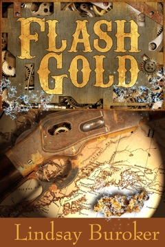
 I’m sure it won’t be a surprise to anybody that art isn’t my specialty. I love finding cool examples of ebook cover art, but I sure couldn’t tell you how to design any (or even what to tell to a designer to get something you love). Fortunately, I’ve got a little help for today’s post.
Glendon Haddix from Streetlight Graphics is here today (he’s the fellow who did the art for my novella, Flash Gold, and he’s reworking the cover design for The Emperor’s Edge and its sequel (coming next month). He’s going to answer a few questions about designing ebook covers, so without further ado…
Interview with Glendon Haddix
Do you want to start out telling us a bit about yourself and how you came to be a cover artist specializing in working with indies?
I’ve been working in engineering for manufacturing using 3D CAD (Computer Aided Design) for 15 years. In 2003 I decided to pursue my passion of graphic design. I started a little website, www.streetlightgraphics.com, to showcase some of my work. After folks found out about it, I started getting requests for this and that. A logo here, business cards there, poster design, tattoo art, websites, and anything even remotely related to graphics.
A little over a year ago my wife, T.L. Haddix, wrote her first book, and she asked me to do the cover. It was like everything else I did, I read all the technical specs and jumped right in. The result (in my opinion) was a clean professional look. Once a few people saw her cover word started spreading. I did one here and one there and it started building. Right now I’m looking to add people to the current team due to demand. I love doing this!
What’s involved in designing a cover? For example, how did you go about coming up with ideas for Flash Gold? I know I threw some elements from the story at you, but you found that cool cog-filled steampunk header on your own. 🙂
Every cover is different, which is what I love about doing them. I start by reading what the story is about and a chapter or two. I wish I could read the entire book, but at the current rates we charge, that’s just not possible. After that usually an idea or two pops in my head and then I pop in some heavy metal and do a mock-up in Photoshop. Send it to the client and ask them if I’m hot or cold and it goes from there. Sometimes I nail it right out of the gate and sometimes it takes several tweaks back and forth.
Flash Gold was fun. My wife and I had made dental appointments on the same day and while she was getting her work done, I sketched the idea out on my trusty clipboard. I could see it in my head. I knew that being a steampunk theme, cogs and gears were essential and needed to be plentiful.
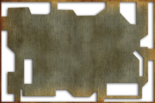
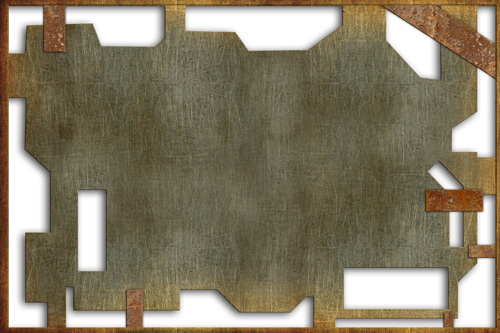
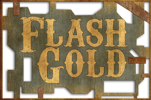
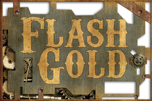
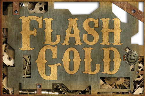
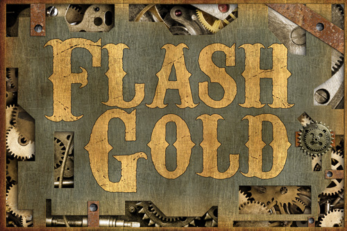
The image I could see in my mind didn’t exist in the real world, so I created it from 10 different stock photos and various other images I drew using Photoshop. (The entire cover used 14 different images not counting the things I drew in, like the lightning.) You can see the progression of how I drew the header it in these images:

What are some of the mistakes you see people making when it comes to cover art (no poking fun at mine now *g*)?
I feel a little guilty answering this one, but mainly what I see is the covers don’t look professional. Text not aligned when it should be, poor choice of fonts, ultra super fancy illegible text, and the overall design creates confusion as to what genre the book is in.
How much does genre impact the sort of cover you design?
Huge. It’s always on my mind. A bloody hand is a cool image, but doesn’t fit for historical romance. The genre is super important. Books that cross genres are the most difficult for me to do, because if not careful, it creates a mixed signal as to what type of book it is.
Can you give us some tips for people who can’t afford to hire a cover artist and need to put together something themselves?
Research, Practice, and Persistence. Your first foray into cover design may very well look just awful. If it does, scrap it and try again. Read books, learn your graphic design software, and look at other covers as examples. Also, Gimp is a great, freeware program to download. It has a lot of the same elements of Photoshop, which can be quite pricey.
For those who are looking to hire a cover designer, can you tell us a bit about your company and what all you guys handle?
We are a very small company and have slowly been building up a team of talented individuals who strongly believe in providing quality work at an affordable rate. All members of our team provide their work on a contract basis, so we don’t have the overhead of a typical design studio. And we are always on the lookout for talented artists, designers, and web gurus to add to the team.
After seeing what my wife goes through just to publish a book (cover, promotion, cover design, ads, blogs, websites, etc.), I decided to change the focus of Streetlight Graphics to help her and the ever growing independent author community. Our primary mission is to provide an affordable one stop shop for authors to get all the services they need so they can spend their time doing what they love…WRITE!
Currently Streetlight Graphics does E-Book covers, print covers, interior E-book and print formatting, banner ads, logo design, and just about anything else related you may need. We have some great package deals where you can get several of these combined at a great price. We don’t do editing, but we recently made an arrangement with Red Adept’s editing services so all Streetlight Graphics clients who are new to Red Adept and who buy an EBook cover from us are eligible for a one-time discount of 10% on her editing services on that same book we did the cover for. And if I may say, Red Adept does fantastic work.
That’s it guys. If you have questions for Glendon, leave them below, and I’ll let him know. Thanks for reading!



Thank you for the tips. It is interesting to see the progression for that ebook and all that goes into creating a cover.
Flash Gold looks great! Glendon designed my cover, too, & I love it.
Some people do their own covers & they look good, but I’m afraid Glendon’s right–not all of them do. (And when you see how much is involved, no wonder!)
Flash Gold’s cover is awesome.
Good information. Thanks to Glendon for sharing.
Very helpful info as usual. Will def bookmark. Thanks both Lindsay & Glendon!
Compared with the other two book covers on the side bar, Flash Gold definitely drew my eye first.
Bought it, read it and hope you write more about Kali’s adventures! I really liked her character.
Loved seeing the process that a designer goes through to create the cover.
Thank you for the post, Lindsay and Brandon.